Socrates

"The only true wisdom is in knowing you know nothing." 

Socrates

"To find yourself, think for yourself."

Nelson Mandela

"Education is the most powerful weapon which you can use to change the world."

Jim Rohn

"Success is nothing more than a few simple disciplines, practiced every day." 

Buddha

"The mind is everything. What you think, you become." 

Friday, 3 July 2020

Movie Color Schemes-The psychology behind colors in film

  1. A well designed movie color palette evokes mood and sets the tone for the film.
We break down the 3 factors to guide your film color decisions. The three main components of a color are hue, saturation, and value.
Hue – the color itself.
Saturation – intensity of the color.
Value – The darkness or lightness of a color


Choosing the right colors for the right spots can create emotions our audience .
For example A strong red color has been shown to raise blood pressure, while a blue color elicits a calming effect.

Color theory norms should be understood by filmmakers, but never seen as a limitation.

The types of  movie Color palettes /Color Schemes

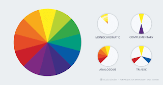
There are a few different  movie color palette. A balanced movie color palette and scheme refers to the harmonious relationships of colors on a color wheel.
 
 The complementary color scheme  :
 Complementary color schemes are when two colors from opposite sides of the color wheel are used in conjunction with one another to form the color palettes. 

The goal of complementary color palettes is to create a visual ‘life’ in the frame. Red and blue, in the instance of Joker (i.e. warm vs. cool), . Dueling colors are often associated with conflict, whether internal or external.Orange and blue are complementary colors used in many blockbusters.

 The monochromatic color scheme:  
 
A monochromatic color scheme is when a single base “hue” is extended out using shades, tones, and tints.
Tints are achieved by adding whites, and shades by adding black. Monochromatic color schemes come in shades of a single color such as red, dark red, and pink.They create a deeply harmonious feeling that is soft, lulling and soothing. 

The Joker is another good example of a monochromatic movie color scheme. Nearly every scene set within the world of the matrix utilizes a brown color palette. Shades of brown permeate everything in the frame to create an unnatural, “sickly” effect.Monochromatic color schemes gives you a color hue within which to create contrast.
ANALOGOUS COLOR SCHEMES:

 Analogous color schemes utilize colors that are next to one another on the complementary color wheel. They tend to occur in nature and create a harmonious feeling that is pleasing to the eye.Since the colors lack the contrast and tension of the complementary colors, they instead create a kind of visual unity.

TRIADIC COLOR SCHEMES : A triadic color scheme is when three colors that are evenly spaced around the complementary color wheel are used in conjunction.One color in the triadic colors scheme is chosen to be the dominant one with other two used in complementary fashion. Triadic color schemes are somewhat less common.
DISCORDANT MOVIE COLOR PALETTES

A movie color palette could all be one way, learning towards one direction, but then suddenly one element sticks out like a sore thumb. Discordant use of color in movies can help a character, detail, or moment truly stand out from the rest of the film. 
For example, the color blue in Amelie, or the color red in The Sixth Sense.  
A movie's color palette is yet another place where storyteller’s can create conflict and drama.

TRANSITIONAL COLOR SCHEMES
Transitional color usage is when a change in colors and color palette indicates a shift  of some sort. Over the course of the series Breaking Bad, Walter White lives a double life as alter ego Heisenberg.