Socrates

"The only true wisdom is in knowing you know nothing." 

Socrates

"To find yourself, think for yourself."

Nelson Mandela

"Education is the most powerful weapon which you can use to change the world."

Jim Rohn

"Success is nothing more than a few simple disciplines, practiced every day." 

Buddha

"The mind is everything. What you think, you become." 

Wednesday, 29 January 2020

Headlines classification

Headlines included in schedule may be classified according to the uses for which they are intended and the kind of job that they have to perform. 

In general, they fall into the following groups

a) Large headlines, Banners and Spreads. 
b) Top heads.
c) Secondary heads. 
d) Subordinate heads.  
e) Contrast heads. 
f) Special feature and departmental heads.


 a. BANNER HEADS


A banner headline is run across eight columns, and placed on top of the front page of the newspaper. It is set in the highest point size that the newspaper style permits. No other headline on the front page is written in a point size bigger than the banner headline.  Newspapers today run banners in the upper lower format too.
The range of the Banner heads extends from 72 points to 120 points, or even larger in certain instances. 

Bolder, larger, open-faced types are usually used in banner heads, since the banner holds the best position on the page and it should be strong and bold. Banner heads are generally set in Bodoni Bold, Bodoni Bold Italic, Gothic face types such as Tempo, Spartan and Railroad Gothic etc. 
The usage of bold and italics depends upon how many banners are there in the page. 
 In writing headlines  set in lower case and all caps are more legible, and most desirable from the standpoint of the reader. 


 b. SPREAD HEADS


For important and heavy display purposes after the banner comes the  spread heads. They display the biggest news of the day with the banner heads. 

Generally the spread heads that are found in the schedule are of the two column and the three-column variety. They may consist of one or more decks with different widths depending on the importance of the story and the effects that are desired on the page. 

In a two column head, the first deck ordinarily consists of 24-30-, Or 36 points type. The second deck is generally set in 14 point, which provides good gradual decrease down into a smaller body type of the story, which follows. The width of the heads differs invariably affecting the number of decks it has and their width.

c. TOP-HEADS


From the standpoint of display Top-Heads come after the banners and spreads. They are called Top-Heads because they feature on the top of the page over some of the biggest and important stories of the day. 

It is difficult to find uniformity in the newspapers as to the number of decks or styles of the forms used in these Top-Heads. However from the general study of newspapers  may find three types of Top-Heads, namely:
 (a) Multiple deck headline, 
(b) Two deck headline, 
(c) Single deck headline. 

 For multiple deck Top-Heads, the form combined is four or sometimes more than four. 

In this particular style of head the top most deck casually consists of three to four times. The letters used are generally of the bold face type, which are set in about 30 to 36 points.

The second deck is smaller than the first and may vary in the type used. This deck is generally set in 14 point bold face. 
The third deck ordinarily set in larger type than that in the second and the fourth decks, which might be set in 18 point bold face.

d. SECONDARY HEADS


There are various other stories which need prominence in display other than top stories which fall under top-heads. Such headings and stories are placed above the fold, and they are referred to as secondary heads.

 Usually the same style and method is used in secondary heads as in the top heads. The secondary heads may have one to two decks. The top deck may consist of two lines or in some instances 3 lines. The second deck consists of 3 to 4 lines and their size and type is same as that of the top heads' second deck. If two secondary heads are included, the no. 3 headline, each consisting of two lines, with the first deck set in 24-point type and the second in 12 or 14-point type. 

The secondary heads have an important place in the daily news headlines. They brighten up the center area of a page. When there is an abrupt drop from major headlines, which are huge and strong, to smaller structures, the page may appear to be grey and weak. To overcome such an unwanted effect good usage of secondary headlines will help the sub-editor. Secondary  headlines are of prime importance in inside-page makeup. Here they are ordinarily used in place of top heads, which frequently are reserved for the front-page use only. 

They are also used as main heads for stories in the inside pages. In the interest of the good design and makeup of the newspaper two or three types of good secondary headlines should be provided, with appropriate sizes and styles of types and fonts. 

 e. SUBORDINATE HEADS

For smaller and less important stories headlines in type sizes from 18 point downward to 12 point are used. Sometimes down until 8 point. Such headlines are known as subordinate heads. In most of the newspaper we find that subordinate heads have 1 or 2 decks with 2 or 3 lines. The headline forms that are used are often flush-left or drop-line and generally they are written in bold face or bold face Italics. For example: English India should agree to tripartite talks India should agree to tripartite talks 66 There is no Telugu example in italic letters. In many instances we find cross-line and inverted pyramids being used. However, cross-line form of head in subordinate headlines is not advisable because it is too small to admit a sufficient number of words in it. Usage of larger sizes in subordinate heads is necessary as one can be assured that greater attention value and sufficient tone is present to break up the dull mass of body type in a color. Though there is a necessity of using several subordinate head it should always be remembered that their usage should not be indiscriminate. Even though arrangements such as usage of more number of subordinate heads provide for a larger number of stories on the page, such a practice is a great mistake. The resulting page designs are grey, dull and uninteresting. So usage of subordinate heads has to be done with lot of caution so that the page design does not get spoiled.

 f. CONTRAST HEADS


Any headline that is used to add some variety and liveliness to the page are called "feature" or "contrast heads". Placing two headlines of the same type and sizes beside each other in adjoining columns may not be so appealing to the page design. To present such inevitable usages contrast heads are very useful. If 2 heads are arranged in the manner mentioned above tend to make up a single unit as far as tone value is concerned. Greater contrast it is believed, will make the resulting effects less monotonous and more interesting. Contrast heads are generally set in italics or any other type which can bring a wide contrast and make it different from the types used in the main headline dress. About two or there lines are used in a single column in width and size, depending upon the effect that is desired. Many headline schedules have box heads or partially boxed heads as the contrast heads. Contrast heads can be of one deck or two decks according to the importance of the stories that are featured in the newspaper. Common sizes used in contrast heads vary from 18 point, 24 point, to 30 point fonts. The 'Astonisher' type of headline is a good example of a contrast head. 


g. CUT-LINES: 

Like the headlines there are various types of heads, which accompany pictures, and are basically used to display and advertise the news as well as enlarge upon it. Such types of heads should also be included in the headline schedule. Lines that are used to explain or to help tell the news involved in an illustration or a picture are called cut-lines. A line, which is placed over or above the picture, is called "over-line" or "caption", and the lines of type that are placed beneath or under the picture 63 are called as "underlines". These over-lines and underlines together are called cut-lines. Newspapers use cut-lines either ways i.e. over and under the picture according to their convenience and page design. Generally bold face types and Italic faces are used for cutlines. The bold ones are more preferred as they have a stronger design and more contrast is shown. Flush-left form or over-line flush-left form are more often used in this case. Some times these pictures are given titles, which form a part of the cut-lines. These titles can feature either above or below the picture. Another common plan that is used in cut-lines is that, first few words in the first line of the under-lines acts as a title. These words are usually set in capitals. Ordinarily 14 or 18-point type is used over pictures of one column in width and 18 or 24-point type are used for picture in two-column width. When cuts are from one to three columns in width, the under-lines usually run the full length of the printed picture. If the picture or illustrations exceed 4 or more columns, cut-lines should be set in two or more columns depending upon the size of the picture. Such an arrangement for larger pictures is necessary because it is difficult to read lines that are longer than three columns. Square-Serif, Gothic, Roman types are commonly used for cut-lines. Some newspapers prefer to box the caption over the picture, and others let the first few words of the cut-line to serve as a caption. Added emphasis could be created by making captions or some times the underlines to feature in capitals or 2.1


Most of the  newspapers commonly use banner heads for their best news.

 a) The cross-line: This is one of the simplest forms available. It basically consists of a single line and one or more columns in width. It may run flush on both sides or words and is centered in measure. Many newspapers commonly use this type. When headlines have one or more columns,

 b) The Drop-line: This type is also known as the 'step line' or 'step head' because the lines in this type are indented and step down uniformly and progressively from the left. It usually consists of two or three lines. The drop line form is used as the main headline as the top deck, when the news has two or more decks. Ex:

 c) The Inverted pyramid: This form is usually employed more as a subordinate deck in a headline. It generally consists of three lines, write the top line exceeding all the way across the column. The next two lines are set to be shorter than the one above, with words centered according to the count or measure. It is one of the difficult forms of headlines as it takes more time of the sub-editor's time in setting. Still it is one of the most widely used forms of headlines.

d) The Hanging intention: The desire to include more lines into the headlines have resulted in this type of headline. Like most of the smaller types of headlines, this type is also used as a subordinate deck. The first line is set to flush on both the sides; and the other lines that follow are indented from the left with an even amount of space. 

 e) The Flush left: It is one of the modern headline forms. It is simple in its design and provides for a lot of freedom in writing headlines. In this type there are one or more lines and the lines are always set to flush to the left hand side of the column.

f) The Spread: A headline or deck, which extends over two or more columns in length, is known as the 'spread'. The 3S flush-left, the drop-line and the cross line are the most common headlines used in the spread. The above-mentioned forms of headlines are very popular and most commonly used in most of the newspapers and magazines. There are various other headline forms or styles, which are used less commonly used or out of use. Some such forms of headlines arc listed to know the variety in headline forms.

a) The Flush line: The unit count in this form of headline must be exact in order to avoid, unwanted amount of white space between the letters or words. Hence, sub editors take great care while writing these headlines. It is the flush-left form taken to it extremes. The amount of white space is reduced between the words to a minimum and the headline looks crowded and uninviting. In most of the newspapers this headline is replaced by the flush-left due to its greater  simplicity. E


b) The Astonisher: It belongs to one of the recent trends in headlines. In this type, a smaller line is set in a smaller type above the main deck. This smaller typed line is a striking statement or facts or idioms, which are intended to gain the attention of the reader. Occasionally it reads into the main deck. This is also called the 'read in' headline, 'over line' headline. Or 'whip-lash'

Rasa – Indian Aesthetic Theory


Rasa is a central concept in Indian aesthetic theory. The term has a variety of meanings Aesthetics refers to a distinctive type of emotional experience that can be experienced in connection with an artwork. The concept is presented in the Nāṭyaśāstra (200-500 C.E.), traditionally attributed to Bharata, a work that amounts to a collection of knowledge on dramatic performance (including music and dancing).
That Nāṭyaśāstra enumerates eight rasas that can be aroused in audience members through skillful performances.
These include
1.     the erotic (śṛṅgāra), 
2.     the comic (hāsya),
3.     the pathetic or sorrowful (karuṇa),
4.     the furious (raudra), the heroic (vīra),
5.     the terrible (bhayānaka),
6.     the odious (bībhatsa), (hateful)and
7.     the marvelous (adbhuta). 
8.     Later interpreters often acknowledged a ninth rasa,
9.     the tranquil (śānta).
Each rasa corresponds to a bhava, an ordinary emotion that is presented in the drama. 
Rasa, however, is a distinctively aesthetic kind experience in which one savors the essence of an emotion type. It is considered to be an achievement, both on the part of performers who are able to bring out the universal dimensions of emotion presented in a play and on that of the audience member who is sufficiently cultivated to appreciate such universalized emotion.
Rasa can be attained only by the person who is detached from personal motives and interests and identifies with the supreme universal Self. 
Abhinava also emphasizes the ninth rasa, the tranquil (śāntarasa), which he sees as the goal of all the other rasas
He compares the experience of this rasa to that of spiritual liberation (moka), which is the goal of every human life.

Emotional states and Rasa 5 The permanent emotional states alone are said to obtain the status of the Rasa. 
They are eight in number of which
 four are primary and 
four are secondary. 
The primary Rasa produces the respective secondary Rasa in the following manner: 1. Erotic (Shringar) to Comic (Hasya); 2. Heroic (Veer) to Marvellous (Adbhut); 3. Furious (Roudra) to Pathetic (Karun); 4. Odious (Bibhatsa) to terrible (Bhayanak); The erotic, comic, heroic, and marvelous are positive traits of mind, however the furious, pathetic, odious, and terrible are negative. The Erotic (Shringar)
 Rasa is derived from the dominant state of love and has its basis in shining and brighter aspects of the world such as white, pure, and beautiful. 
The Comic (Hasya) Rasa has its basis in the dominant emotion of laughter. It is derived from showing unseemly dress or ornament, impudence, greediness, quarrel or defective limb. 
The Heroic (Veer) Rasa has its basis in the superior type of persons, grandeur, greatness, goodness, strength and energy. It displays concentration of mind, perseverance, diplomacy, discipline, military strength, aggressiveness, reputation of might, and frightening capacity etc. 
The Marvellous (Adbhut) Rasa finds its basis in the dominant state of astonishment. It is derived from the determinants such as sight of heavenly being or events, attainment of desired object, entrance into superior mansion, temple, audience hall, seeing illusory and magical acts etc.
 The Furious (Roudra) Rasa finds its basis in the dominant state of anger. It is derived from the determinant such as anger, rape, abuse, insult, untruth, allegation, jealousy and the like. The Rakshasas, Danavas, and haughty men are its sources.
 6 The Pathetic (Karun) Rasa is rooted in the dominant state of sorrow, misery, and suffering. It is derived from determinants such as afflictions due to separation from dear ones, divorce, loss of wealth, person, death, accident or plight and captivity. 
The Odious (Bibhatsa) Rasa has the dominant state of disgust. It is derived from determinants such as hearing of unpleasant, offensive, impure, harmful things or seeing and discussing them. On the stage it can be represented by consequents such as stopping the movement of all limbs, narrowing down the mouth and the like. 
The Terrible (Bhayanak) Rasa is rooted in the dominant state of fear. It is derived from the determinants such as hideous noise, sight of ghost, panic, anxiety, or voices of jackals and owls, an empty house, dense forest, sight of murder or death of hearing and discussion of such events and also horripilation, change of color and loss of voice etc. The wise should know that the Vibhav and the Anubhav are such matters in the art of acting as are actually created by human nature, and as closely follow the ways of human nature and worldly conduct” (Ibid:10). ‘Lokatraya’ has been the core content of the art. The human nature and conduct of the world being the guiding principle

Nishpatti According to Bharata, “Nishpatti is a manifestation (Abhivyakti) of what was already latent.” Abhinav says, “All Rasas are dominated by pleasure, because of being the manifest and uninterrupted form of tasting ones own consciousness” (Ghosh M.M. 1950:8) Debate over Shantih: Is it a Rasa? Abhinav Gupta considers Shantih (peace) as the ninth Rasa. This is the point of debate over its status of Rasa in the tradition of Sanskrit scholarship in art and literature. The debate provides new directions and insights in exploring the nature of man and the nature of art from the point of view of dramatic performance and aesthetic realization of both entertainment and instruction for proper education and culture. 

Monday, 20 January 2020

Michelangelo, his Paintings, and Sculptures

Michelangelo was one of the most inspirational and talented artists in modern history. Michelangelo was born on March 6, 1475 in Caprese near Arezzo, Tuscany Italy.

At age of 6, Michelangelo was sent to a Florence grammar school but he showed no interest in schooling. His father realized he had no interest in family's financial business and agreed to send him, to the painter Ghirlandaio to be trained as an apprentice at the age of 13. Michelangelo learned the technique of Fresco and draftsmanship (. a person who draws plans and sketches)

 He was the first artist who was recognized during his life time. He is also the first western artist whose biography was published when he is still alive. Two biographies for him was written, one was by Giorgio Vasari, who praised Michelangelo as the greatest artist since the beginning of renaissance. He is the best documented artist in 16th Century and has influenced so many areas of art development in the West. Together with Leonardo Da Vinci, the two stood out as strong and mighty-personalities with two  opposed attitudes to art, yet with a bond of deep understanding between them.

During his life, the western world underwent the Renaissance, which  changes in all aspects of life and culture, with dramatic reforms sweeping through the worlds of religion, politics, and scientific belief. 

Michelangelo was one of the most fervent(having or displaying a passionate intensity.) advocates of this exciting new philosophy, working with a remarkable energy that was mirrored by contemporary society. 

One of  the Italian Renaissance, his extraordinary talents emerged in early works such as the Pieta for the Vatican,  .and the statue of David commissioned for the city of Florence. 

(One of Michelangelo’s masterpieces, the most poetic and marvellous sculpture ever created.Michelangelo arrived in Rome in 1496 when he was 21 years old .   It was while in Rome, that Michelangelo sculpted Pieta, now in St. Peters in the Vatican, in which the Virgin Mary weeps over the body of Jesus. Michelangelo went to the marble quarry and selected the marble for this exquisite piece himself. It was frequently said that Michelangelo could visualise the finished sculpture just be gazing at a block of stone.


WHEN AND WHEN MICHELANGELO’S PIETA’ WAS CREATED


Michelangelo’s Pietà is the first sculpture created in Rome by Michelangelo, who at that time was in his early 20s (1497-1499) and was rather famous.
It’s one of the great masterpieces created by Michelangelo  and is also the only work where his signature is visible, carved on the sash running across Mary’s chest.

2. WHO COMMISSIONED MICHELANGELO TO CARVE THE PIETA’
Cardinal  Jean de Bilhères, who served as French ambassador of Charles VIII to the Papal States, commissioned Michelangelo to create the Pietà, a work that had to be his funeral monument and had to be placed in the Chapel of Santa Petronilla in Saint Peter’s Basilica. However, when the sculpture was displayed to the public, everybody stared at it in fascination and admiration, so in 1517 it was decided to place it in the sacristy of St. Peter’s Basilica.

3. MICHELANGELO’S PIETA’: STYLE
The agreement between Michelangelo and his client to make the Pietà, was signed on August 27th 1498, and contains the description of the subject.
Michelangelo didn’t limit himself to create the Pietà following the classical model, which established Mary’s vertical bust and Jesus’ horizontal body, but he modernized a traditional composition and gave the work a natural appearance never seen before.

4. MICHELANGELO’S PIETA’: DESCRIPTION
Mary is represented by Michelangelo as a young woman, sat on a rock symbolizing the Calvary (or the Golgotha), the mount where Jesus was crucified.
Jesus, instead, lays down on his mother’s legs, dead.
A lot has been written about Mary’s face, too young according to some critics, but Michelangelo probably wanted to allude to Virgin Mary’s beauty, which is more spiritual than physical.

5. MICHELANGELO’S PIETA’: FORTUNES AND EVENTS
Since its creation, Michelangelo’s Pietà has been considered a masterpiece.
In 1964 Michelangelo’s Pietà was loaned to the 1964–1965 New York World’s Fair and visitors waited in queue for hours to admire the sculpture!

He was now a man at the height of his creative powers, and, in 1504, back in  Florence, he completed his most famous sculpture, David. David, depicted at the moment he decides to battle Goliath, was a symbol of Florentine freedom. It is said to be a masterpiece of line and form. A committee, including Leonardo da Vinci and Sandro Botticelli, was created and decided on its placement, in front of the Palazzo Vecchio.

Michelangelo’s David stands nearly 17 feet tall.  Remember that the biblical figure of David was special to the citizens of Florence—he symbolized the liberty and freedom of their republican ideals, which were threatened at various points in the fifteenth century by the Medici family and others. Watch a video about the importance of the figure of David for Florence.David of Angelo

His paintings and frescoes(a painting done rapidly in water colour on wet plaster on a wall or ceiling, so that the colours penetrate the plaster and become fixed as it dries.) were largely taken from mythological and classical sources works. He manage to combine his high level of technical competence and his rich artistic imagination to produce the perfect High-Renaissance blend of aesthetic harmony and anatomical accuracy in his works.
This grand fresco contains over three hundred figures over five hundred square meters of ceiling. It took Michelangelo four years, lying on his back, to complete this masterful work, which stands even today as a testament to this one man's dedicated and accomplished artistry. The scenes depicted are from the Book of Genesis, the most famous of which is The Creation of Adam. The outstretched hands of God and Adam are an iconic image, perhaps the most widely known and imitated detail from any renaissance piece. Michelangelo, in this work, demonstrated his deep understanding of the human form, and how to depict it in a huge array of different poses.

Michelangelo became, during this time, an expert in portraying the human form, drawing from life and studying anatomy. He also obtained special permission from the Catholic Church to study human corpses to learn anatomy, though exposure to corpses had worsened his health condition
Michelangelo accepted many commissions, sculptures and paintings during his time in Florence, many of which went unfinished when, in 1505, he was called back to Rome to work on a Tomb for Pope Julius II. It was planned to be finished within 5 years but he worked on it (with frequent interruptions) for over forty years, and it seems it was never finished to his satisfaction. Fortunately, Michelangelo also completed some of his best, and most well-known work, during this time, most notably the fresco on the ceiling of the Sistine Chapel, which took him four years to finish.

Michelangelo's art has far reaching historic influence. His world is genetically a two-fold system continually expanding. Measuring his internal development from the Pieta through David to The Last Judgement, we view the path of an experience in which each stage provides the foundation for the next, from sculpture to painting, painting to architecture, architecture to the art of poetry.

In western world, he was the first - Picasso the last - to regard himself as an absolute and mythic cultural experience. He managed to combine his high level of technical competence and his rich artistic imagination to produce the perfect High Renaissance blend of aesthetic harmony and anatomical accuracy in his work.

Just like William Shakespeare on literature, and Sigmund Freud on psychology, Michelangelo's impact on art is tremendousMichelangelo not only outshines all his predecessors; he remains the only great sculptor of the Renaissance at its best. What most Late Renaissance artists lacked was not talent but the ability to use their own eyes and share a vision with either their contemporaries or posterity. Michelangelo's extreme genius left little scope for works that escaped his influence, damning all his contemporaries to settle for aping him. Appreciation of Michelangelo's artistic mastery has endured for centuries, and his name has become synonymous with the best of the Renaissance Art.


Friday, 10 January 2020

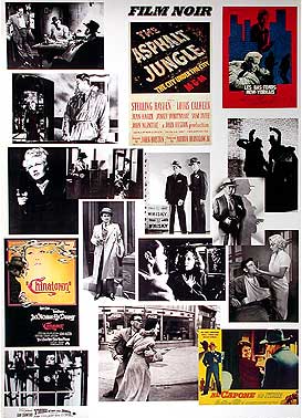
Film Noir

Film Noir (literally 'black film or cinema') was coined by French film critics (first by Nino Frank in 1946) who noticed the trend of how 'dark', downbeat and black the looks and themes were of many American crime and detective films released in France to theatres following the war, such as  The Maltese Falcon (1941)Murder, My Sweet (1944) Double Indemnity (1944)The Woman in the Window (1944), and Laura (1944). A wide range of films reflected the resultant tensions and insecurities of the time period, and counter-balanced the optimism of Hollywood's musicals and comedies. Fear, mistrust, bleakness, loss of innocence, despair and paranoia are readily evident in noir, reflecting the 'chilly' Cold War period when the threat of nuclear annihilation was ever-present. The criminal, violent, misogynistic, hard-boiled, or greedy perspectives of anti-heroes in film noir were a metaphoric symptom of society's evils, with a strong undercurrent of moral conflict, purposelessness and sense of injustice. There were rarely happy or optimistic endings in noirs.
Classic film noir developed during and after World War II, taking advantage of the post-war ambience of anxiety, pessimism, and suspicion. It was a style of black and white American films that first evolved in the 1940s, became prominent in the post-war era, and lasted in a classic "Golden Age" period until about 1960 (marked by the 'last' film of the classic film noir era, Orson Welles'  Touch of Evil (1958)).
Important Note: Strictly speaking, film noir is not a genre, but rather the mood, style, point-of-view, or tone of a film. It is also helpful to realize that 'film noir' usually refers to a distinct historical period of film history - the decade of film-making after World War II, similar to the German Expressionism or the French New Wave periods. However, it was labeled as such only after the classic period - early noir film-makers didn't even use the film designation (as they would the labels "western" or "musical"), and were not conscious that their films would be labeled noirs.
Very often, a film noir story was developed around a cynical, hard-hearted, disillusioned male character [e.g., Robert Mitchum, Fred MacMurray, or Humphrey Bogart] who encountered a beautiful but promiscuous, amoral, double-dealing and seductive femme fatale [e.g., Mary Astor, Veronica Lake, Jane Greer, Barbara Stanwyck, or Lana Turner]. She would use her feminine wiles and come-hither sexuality to manipulate him into becoming the fall guy - often following a murder. After a betrayal or double-cross, she was frequently destroyed as well, often at the cost of the hero's life. As women during the war period were given new-found independence and better job-earning power in the homeland during the war, they would suffer -- on the screen -- in these films of the 40s.
See this site's special tribute to
Greatest Femmes Fatales in Classic Film Noir
Titles of many film noirs often reflected the nature or tone of the style and content itself: Dark Passage (1947)The Naked City (1948)Fear in the Night (1947) Out of the Past (1947)Kiss Me Deadly (1955), etc.
Primary Characteristics and Conventions of Film Noir: Themes and Styles
The primary moods of classic film noir were melancholy, alienation, bleakness, disillusionment, disenchantment, pessimism, ambiguity, moral corruption, evil, guilt, desperation and paranoia.
Heroes (or anti-heroes), corrupt characters and villains included down-and-out, conflicted hard-boiled detectives or private eyes, cops, gangsters, government agents, a lone wolf, socio-paths or killers, crooks, war veterans, politicians, petty criminals, murderers, or just plain Joes. These protagonists were often morally-ambiguous low-lifes from the dark and gloomy underworld of violent crime and corruption. Distinctively, they were cynical, tarnished, obsessive (sexual or otherwise), brooding, menacing, sinister, sardonic, disillusioned, frightened and insecure loners (usually men), struggling to survive - and in the end, ultimately losing.
Storylines were often elliptical, non-linear and twistingNarratives were frequently complex, maze-like and convoluted, and typically told with foreboding background music, flashbacks (or a series of flashbacks), witty, razor-sharp and acerbic dialogue, and/or reflective and confessional, first-person voice-over narration. Amnesia suffered by the protagonist was a common plot device, as was the downfall of an innocent Everyman who fell victim to temptation or was framed. Revelations regarding the hero were made to explain/justify the hero's own cynical perspective on life.
Film noir films (mostly shot in gloomy grays, blacks and whites) thematically showed the dark and inhumane side of human nature with cynicism and doomed love, and they emphasized the brutal, unhealthy, seamy, shadowy, dark and sadistic sides of the human experience. An oppressive atmosphere of menace, pessimism, anxiety, suspicion that anything can go wrong, dingy realism, futility, fatalism, defeat and entrapment were stylized characteristics of film noir. The protagonists in film noir were normally driven by their past or by human weakness to repeat former mistakes.
Film noir films were marked visually by expressionistic lighting, deep-focus or depth of field camera work, disorienting visual schemes, jarring editing or juxtaposition of elements, ominous shadows, skewed camera angles (usually vertical or diagonal rather than horizontal), circling cigarette smoke, existential sensibilities, and unbalanced or moody compositions. Settings were often interiors with low-key (or single-source) lighting, venetian-blinded windows and rooms, and dark, claustrophobic, gloomy appearances. Exteriors were often urban night scenes with deep shadows, wet asphalt, dark alleyways, rain-slicked or mean streets, flashing neon lights, and low key lighting. Story locations were often in murky and dark streets, dimly-lit and low-rent apartments and hotel rooms of big cities, or abandoned warehouses. [Often-times, war-time scarcities were the reason for the reduced budgets and shadowy, stark sets of B-pictures and film noirs.]
Some of the most prominent directors of film noir included Orson Welles, John Huston, Billy Wilder, Edgar Ulmer, Douglas Sirk, Robert Siodmak, Fritz Lang, Otto Preminger, Henry Hathaway and Howard Hawks.
The females in film noir were either of two types (or archetypes) - dutiful, reliable, trustworthy and loving women; or femmes fatales - mysterious, duplicitous, double-crossing, gorgeous, unloving, predatory, tough-sweet, unreliable, irresponsible, manipulative and desperate women. Usually, the male protagonist in film noir wished to elude his mysterious past, and had to choose what path to take (or have the fateful choice made for him).
Invariably, the choice would be an overly ambitious one, to follow the dangerous but desirable wishes of these dames. It would be to pursue the goadings of a traitorous, self-destructive femme fatale who would lead the struggling, disillusioned, and doomed hero into committing murder or some other crime of passion coupled with twisted love. When the major character was a detective or private eye, he would become embroiled and trapped in an increasingly-complex, convoluted case that would lead to fatalistic, suffocating evidences of corruption, irresistible love and death. The femme fatale, who had also transgressed societal norms with her independent and smart, menacing actions, would bring both of them to a downfall.
Cinematic Origins and Roots of Classic Film Noir:
The Cabinet of Dr. Caligari - 1919The themes of noir, derived from sources in Europe, were imported to Hollywood by emigre film-makers. Noirs were rooted in German Expressionism of the 1920s and 1930s, such as in The Cabinet of Dr. Caligari (1920, Germ.)or Fritz Lang's M (1931, Germ.)Fury (1936) and You Only Live Once (1937). Films from German directors, such as F. W. Murnau, G. W. Pabst, and Robert Wiene, were noted for their stark camera angles and movements, chiaroscuro lighting and shadowy, high-contrast images - all elements of later film noir. In addition, the French sound films of the 30s, such as director Julien Duvivier's Pepe Le Moko (1937), contributed to noir's development.
Another cinematic origin of film noir was from the plots and themes often taken from adaptations of American literary works - usually from best-selling, hard-boiled, pulp novels and crime fiction by Raymond Chandler, James M. Cain, Dashiell Hammett, or Cornell Woolrich. As a result, the earliest film noirs were detective thrillers. Film noirwas also derived from the crime/gangster and detective/mystery sagas from the 1930s (i.e., Little Caesar (1930)Public Enemy (1931) and Scarface (1932)), but very different in tone and characterization. Notable film noir gangster films, such as They Drive By Night (1940)Key Largo (1948) and White Heat (1949) each featured noir elements within the traditional gangster framework.
The Earliest Film Noirs: In the 1940s
Many sources have claimed that director Boris Ingster's and RKO's Stranger on the Third Floor (1940) was the first full-featured film noir. The expressionistic film starred Peter Lorre as the sinister 'stranger' (cast due to his creepy performance in M (1931)), in a story about the nightmarish after-effects of circumstantial testimony during a murder trial. Others claim Orson Welles' masterpiece  Citizen Kane (1941) was also an early and influential pre-film noir.
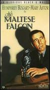
The Maltese Falcon - 1941The first detective film to use the shadowy, nihilistic noir style in a definitive way was the privotal work of novice director John Huston in the mystery classic  The Maltese Falcon (1941), from a 1929 book by Dashiell Hammett. [Actually, Huston's film was not the first version - it had been directed earlier by Roy Del Ruth in 1931, starring Ricardo Cortez in the lead role.] It was famous for Humphrey Bogart's cool, laconic private eye hero Sam Spade in pursuit of crooks greedy for a jewel-encrusted statue, and Bogart's foil - Mary Astor as the deceptive femme fatale.
Noir Duo: Alan Ladd and Veronica Lake
The Blue Dahlia - 1946The acting duo of Alan Ladd and Veronica Lake was first teamed in the superb early noir thriller This Gun For Hire (1942) (with the tagline: "He's dynamite with a gun or a girl"). From the novel A Gun For Sale by renowned British novelist Graham Greene, the moody noir featured Ladd in a star-making role (his first lead role) as a ruthless, cat-loving, vengeful, unsmiling San Francisco professional hit-man named Raven working for a peppermint-candy loving fat man Willard Gates (Laird Cregar) and his wheelchair-bound Nitro Chemicals executive Alvin Brewster (Tully Marshall) - both double-crossers who were selling secrets to foreign agents (the Japanese). Ladd was paired with popular wartime pinup star Lake as nightclub showgirl singer Ellen Graham, his hostage (and unbeknownst to him working as a federal agent).
Another Dashiell Hammett book of political corruption and murder was adapted for Stuart Heisler's The Glass Key (1942) for Paramount Studios - again with the duo of Ladd and Lake, and noted as one of the best Hammett adaptations. Ladd starred as Ed Beaumont, a right-hand man and political aide attempting to save his employer (Brian Donlevy) from a murder frame-up, while Lake played the seductive fiancee of the boss. The film was noted for the vicious beating given to Ladd by a crime lord thug (William Bendix).
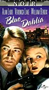
The popular noir couple were brought together again in George Marshall's post-war crime thriller The Blue Dahlia (1946), with an Oscar-nominated screenplay by Raymond Chandler (the only work he ever wrote directly for the screen). Alan Ladd portrayed returning war veteran Johnny Morrison who discovered that his wife Helen (Doris Dowling) was unfaithful during his absence. When she turned up dead and he became the prime suspect, he was aided in the case by the mysterious Joyce Harwood (Lake) - the seductive ex-wife of his wife's former lover.

Orson Welles and Film Noir:
Orson Welles' films have significant noir features, such as in his expressionistically-filmed  Citizen Kane (1941), with subjective camera angles, dark shadowing and deep focus, and low-angled shots from talented cinematographer Gregg Toland. Welles' third film for RKO, the war-time mystery Journey Into Fear (1943), was one in which he acted and co-directed (uncredited) - it was set in the exotic locale of Istanbul. The film's story was inspired by Eric Ambler's spy thriller about the flight of an American arms engineer (Joseph Cotten) on a Black Sea tramp steamer where he was threatened by Nazi agents intent on killing him.
The complex The Lady from Shanghai (1948) - with its plot (from Sherwood King's novel If I Should Die Before I Wake), told about a destructive love triangle between Irish seaman Michael O'Hara (Welles himself), a manipulative Rita Hayworth as the platinum blonde-haired femme fatale Elsa (or Rosalie), and her husband Arthur Bannister (Everett Sloane). Its final sequence in a San Francisco "hall of mirrors" fun-house was symbolic and reflective of the shattered relationships between the characters, exemplified by a wounded O'Hara's last words: "Maybe I'll live so long that I'll forget her. Maybe I'll die trying."
Welles' Mexican border-town B-movie classic  Touch of Evil (1958) is generally considered the last film in the classic cycle of film noirs. It starred Charlton Heston as Vargas - a naive Mexican-American narcotics cop, Janet Leigh as his imperiled, honeymooning wife Susan, and Welles' own corrupt and corpulent local cop Hank Quinlan. The film also featured a comeback appearance by cigar-smoking bordello madam Marlene Dietrich, and a breathtaking opening credits sequence filmed in a single-take. Later, Welles' expressionistic noir and psychological drama The Trial (1962) was an adaptation of Franz Kafka's classic novel, with Anthony Perkins as Joseph K - a man condemned for an unnamed crime in an unknown country.
More Definitive 40s Noirs:
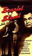
Scarlet Street - 1945Early classic non-detective film noirs included Fritz Lang's steamy and fatalistic Scarlet Street (1945) - one of the moodiest, blackest thrillers ever made, about a mild-mannered painter's (Edward G. Robinson) unpunished and unsuspected murder of an amoral femme fatale (Joan Bennett) after she had led him to commit embezzlement, impersonated him in order to sell his paintings, and had been deceitful and cruel to him - causing him in a fit of anger to murder her with an ice-pick. Director Abraham Polonsky's expressionistic, politically-subversive Force of Evil (1948) starred John Garfield as a corrupt mob attorney.

British director Carol Reed's tense tale of treachery set in post-war Vienna,  The Third Man (1949), with the memorable character of black market racketeer Harry Lime (Orson Welles), ended with a climactic shootout in the city's noirish underground sewer. And the nightmarishly-dark, rapid-paced and definitive D.O.A. (1949) from cinematographer-director Rudolph Mate - told the flashback story of lethally-poisoned and doomed protagonist Frank Bigelow (Edmond O'Brien), a victim of circumstance who announced in the opening: "I want to report a murder - mine." [It was remade as D.O.A. (1988) with Dennis Quaid and Meg Ryan.]


https://www.amazon.in/ref=as_li_ss_tl?ie=UTF8&ext_vrnc=hi&ascsub&ext_vrnc=hi&gclid=CjwKCAiA3uDwBRBFEiwA1VsajIdU1Lr5c4UMjyCyTfWedmyaDnoxkA9LpWjjom-1oQ3rOkuy4IsVZxoCIQ4QAvD_BwE&linkCode=ll2&tag=abel047-21&linkId=d62fa0b7a401db916cc93c12f5feadd9&language=en_IN